

The Leverett House

A Modern Mark for a Historic Home
THE BRIEF
The Leverett House is a family-friendly three bed, three bath home in the heart of Keene, originally built in the 1920s and thoughtfully renovated for modern stays. As new hosts, the homeowners needed a brand that felt professional, welcoming, and legitimate for first-time guests, while still feeling familiar for returning visitors.
THE TEAM
Creative Direction Josh Blair
Brand Design Sawyer Culberson, Alonzo Smith
Bringing a Vision to Life
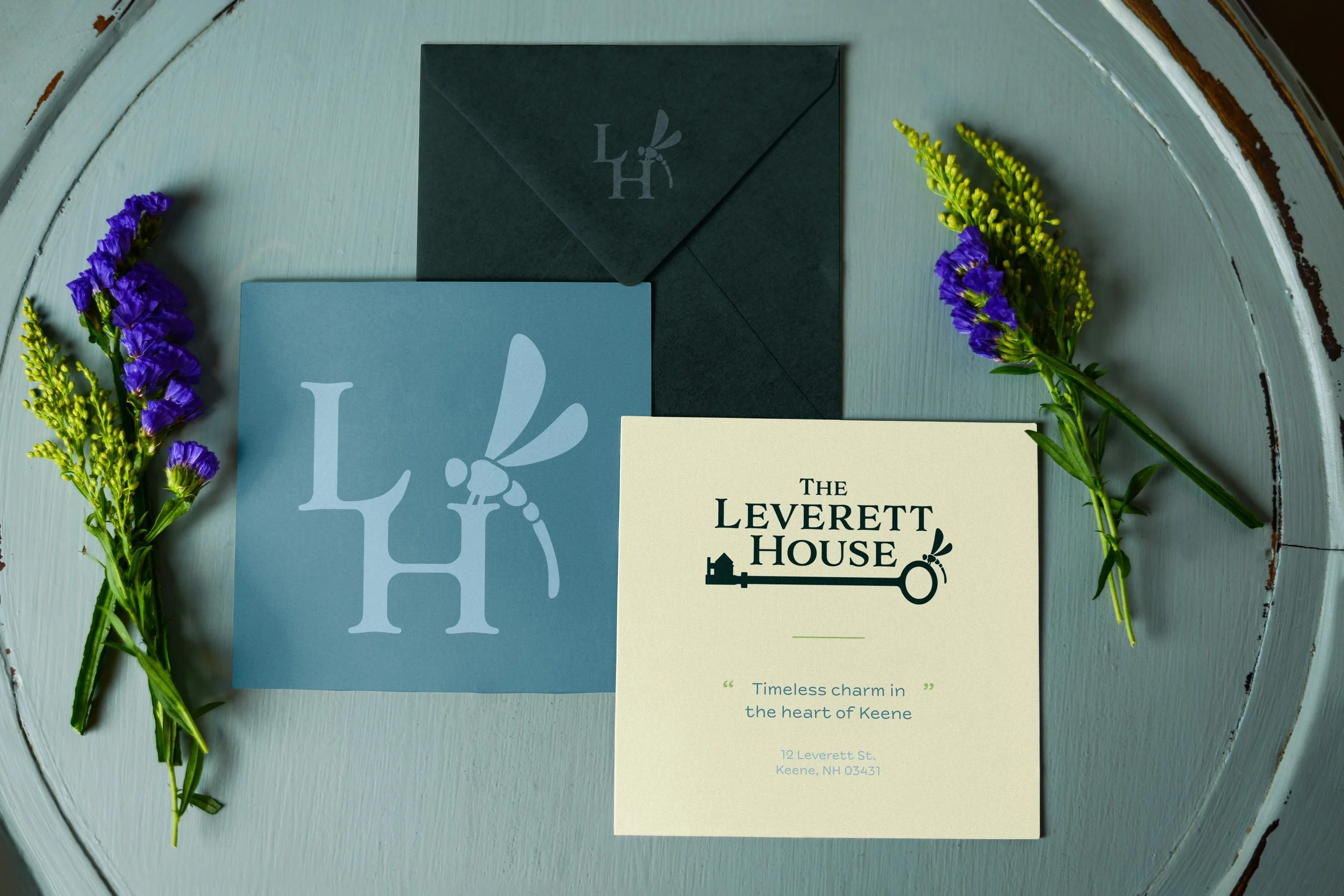
The owners came to us with an AI-generated logo and a request to keep two elements of the design – a personal dragonfly motif that appears throughout the home, and a quiet nod to the history of the space through its original details, like vintage keys, hardware, and timeworn accents. Our role was to refine those ingredients into a cohesive identity system that could live across platforms and scale with their growing hosting venture.
Our Approach
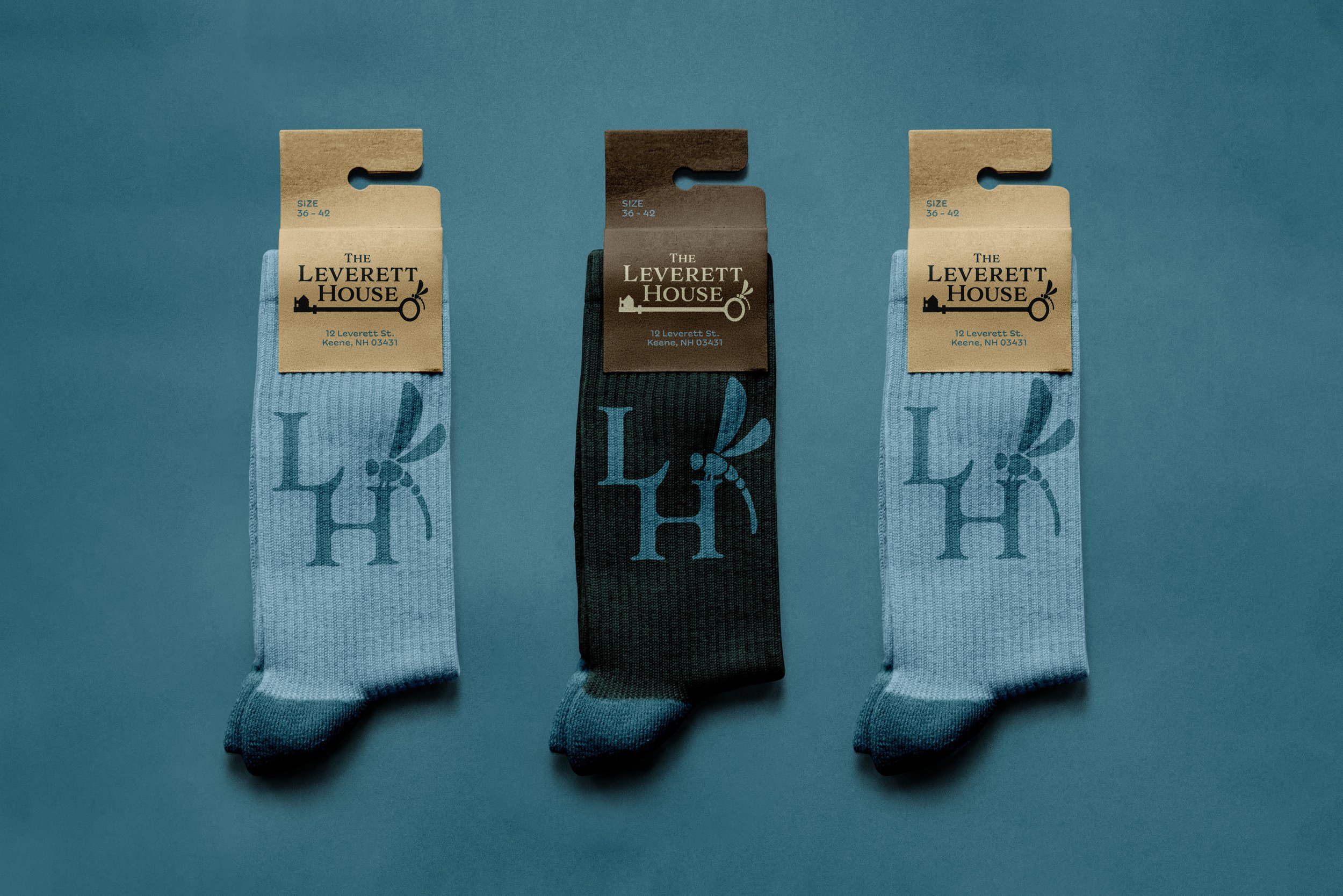
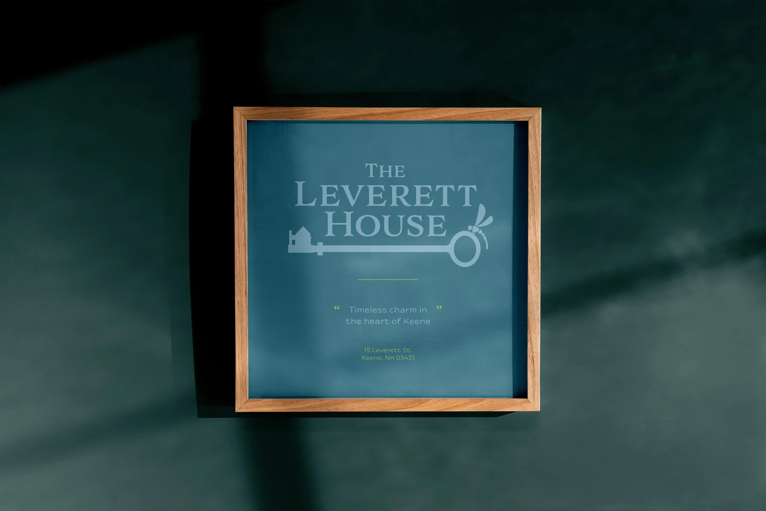
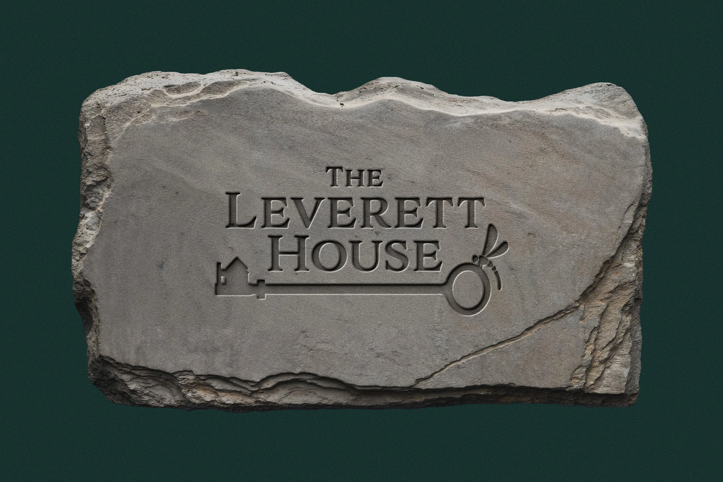
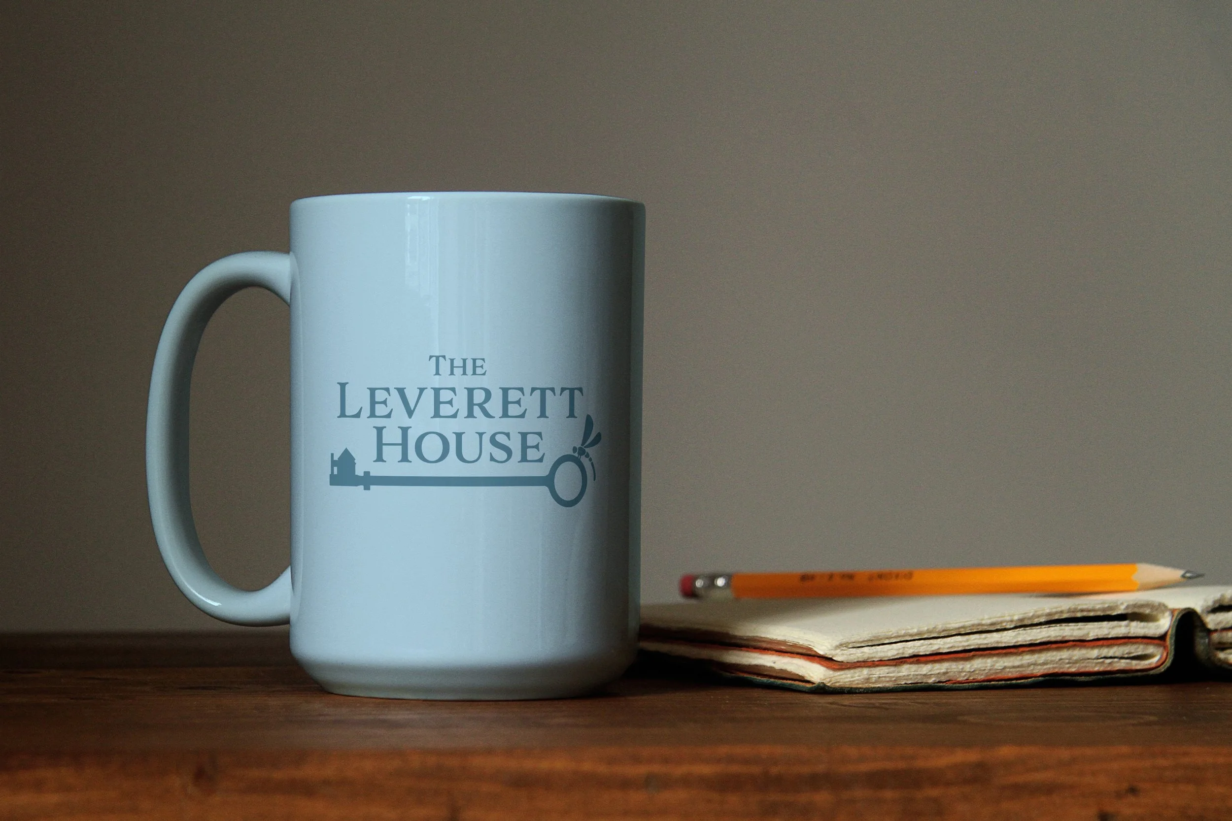
We translated real details that make The Leverett House feel lived-in and cared for into iconography that could carry the brand without feeling decorative. The system centers on three anchors: the silhouette of the house, an original vintage key, and a dragonfly element.
The elements were composed to support the typography without competing for space. Using tones already present inside the home, including the house blue and supporting neutrals, we reiterated a color palette and brand that balances a calm and inviting atmosphere with enough structure to feel established.
Throughout the collaboration, we kept one guiding idea in view. Guests should feel like they are welcome in a real home (like visiting family) while still feeling confident they are booking a polished and trustworthy stay.
DELIVERABLES
Primary logo and logo mark
Color palette
Typography system
Essential brand guide for consistent use across platforms
Finished Logo


OUTCOMES
A cohesive identity that feels warm, credible, and aligned with the home’s character.
Refined iconography that brings together the house silhouette, dragonfly motif, and heritage details without clutter.
A calm palette rooted in the space itself, designed to welcome guests and build trust at a glance.
A practical brand foundation the owners can use immediately, and build on as social and marketing roll out.
Is your business ready to become a community staple?